Snug Sleep

A Rebrand of Sleeptite; an innovative mattress company committed to thoroughly analysing and consistently enhancing the overall quality of sleep experienced by its customers.
Project Overview
Brief
As a graphic designer, I was tasked with selecting a single brand and creating a comprehensive rebrand to refresh and revitalize the new identity. The company chosen for this project was Sleeptite, an innovative bed company known for its quality and comfort. In this brief, we were expected to challenge our creativity by designing a variety of logo mockups, experimenting with different colour palettes, and ultimately applying the new brand identity across a range of products. This process aimed to not only update the visual elements but also strengthen the brand’s presence in the market.
Process
This project required an in-depth understanding of the company’s existing core values and the ability to effectively translate them into the new brand identity. Additionally, new complementary brand values were developed to help support and enhance the current foundation. Conducting thorough research to fully understand the client’s background and objectives was essential in determining which design elements would best suit their company. Multiple iterations of the designs were created and refined numerous times, with all work being produced using Adobe Illustrator.
Solution
The solution would be to develop a brand that feels more modern and contemporary, while clearly reflecting comfort and quietness within the logo design. This approach would evoke the sense of a truly comfortable night’s sleep, inviting customers to experience restfulness and tranquility through the brand’s identity.

Figuremark Experimentations
Understanding the Pain Points
Brainstorm
Researching various ways to depict comfort and sleep was essential to broaden the range of possibilities for the design’s final appearance and ensure it resonated emotionally. After carefully choosing to focus on the concept of a cat sleeping on the moon, it then became necessary to conduct further detailed exploration and analysis to capture the right mood, style, and visual elements that would bring the idea to life effectively.
Experimentation
Exploring the various positions where the lettermark and tagline could cohesively sit within the logo took numerous attempts to discover the most effective and visually balanced solution. Finalizing the last refinements before applying the design across different applications demanded a great deal of patience and attention to detail to achieve a polished and perfect result.
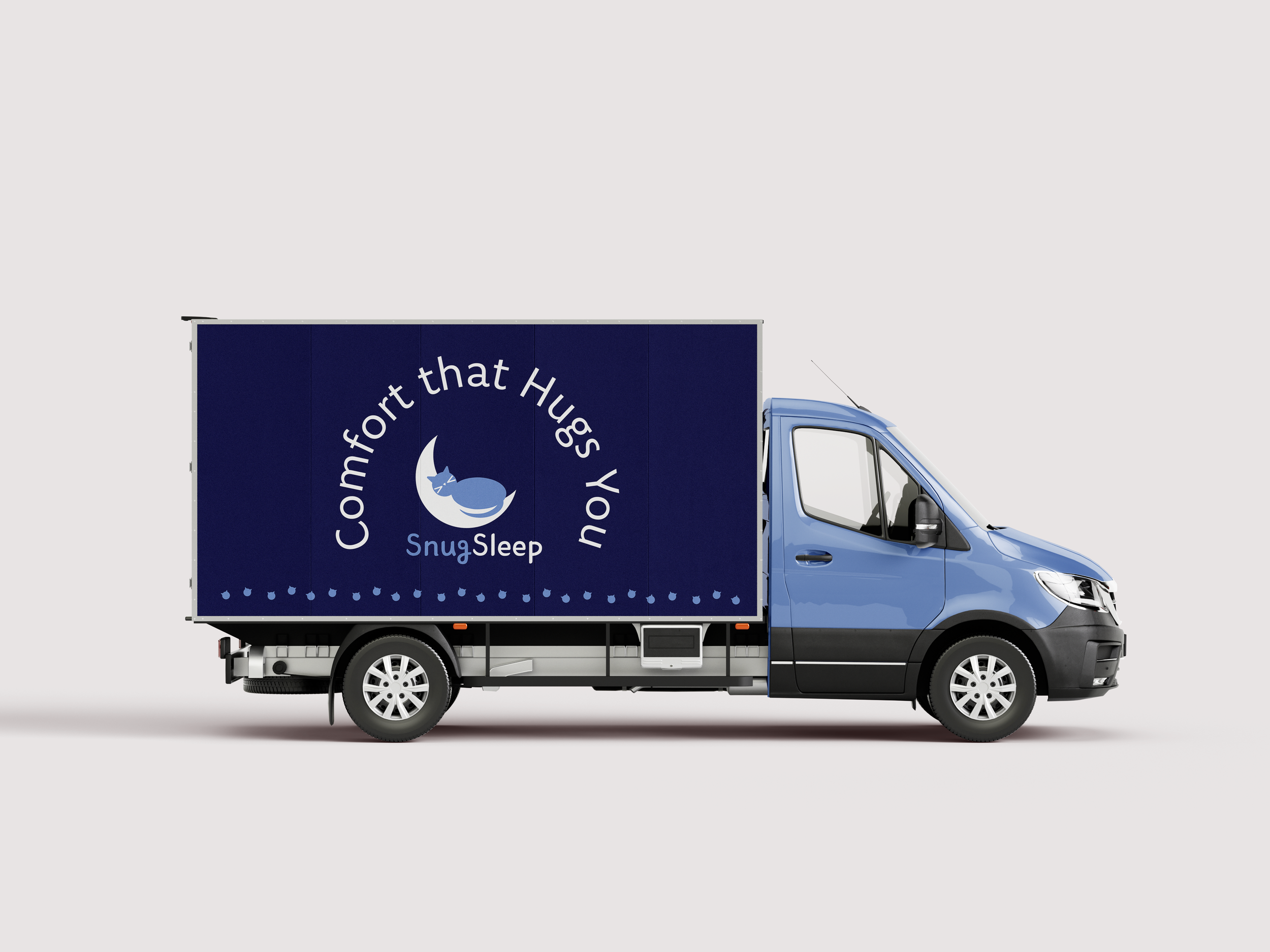
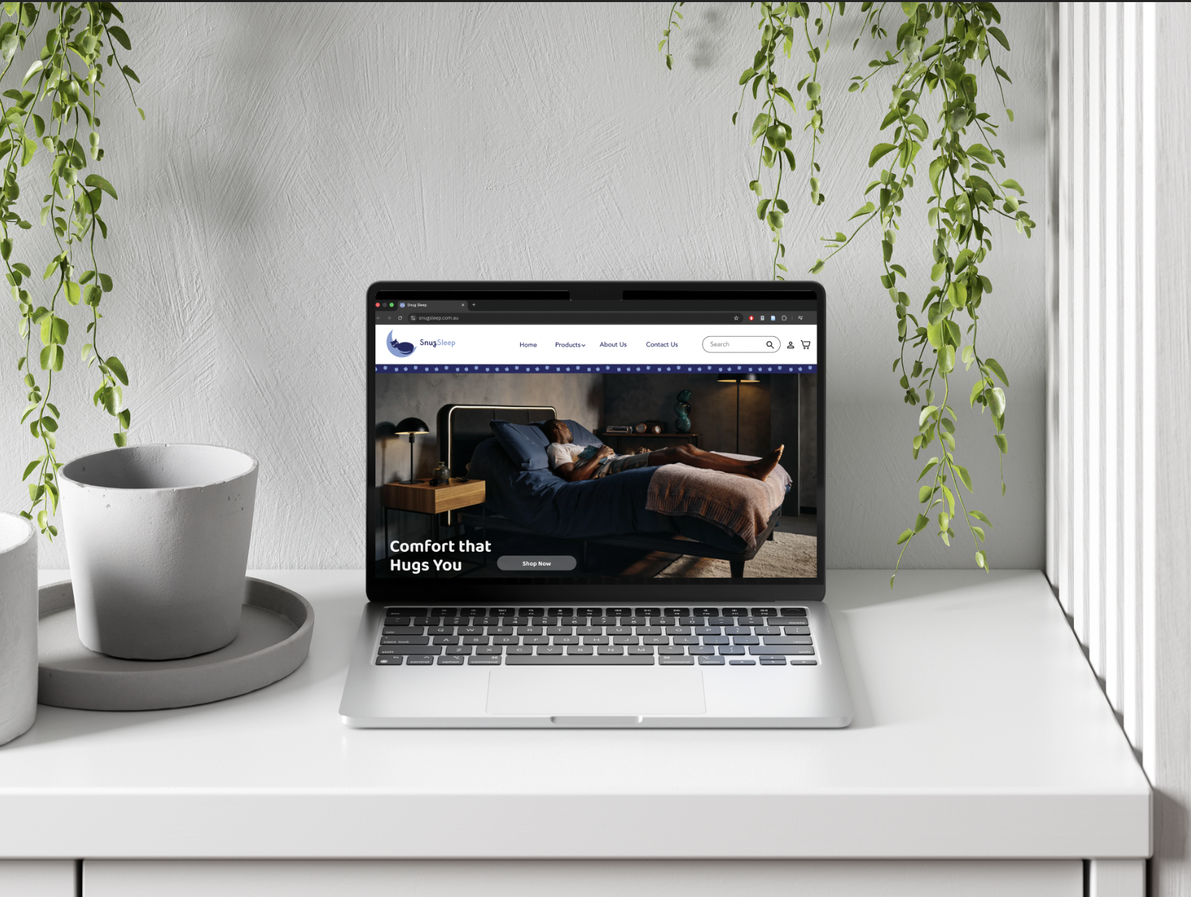
Brand Applications
-
Brand Applications -