Charm Malgeun Vivid Soju
Carefully planned and thoughtfully crafted studio time to thoroughly explore and understand the intricate effects of lighting and shadows created on translucent bottles.

Brief
As an Art Director and Photographer, I was tasked with selecting a physical bottle item that is translucent in nature and creating both a studio poster and a billboard advertisement featuring this product. The final design must prominently include the brand logo, the product name, and a compelling tagline. During the photoshoot, careful attention must be paid to the lighting setup and the shadows cast by artificial lighting, as well as the strategic placement of all elements to ensure a visually striking and coherent composition.
Process
Planning the studio time ideas, directing the shoot, and experimenting with different concepts provided a much deeper and clearer understanding of how lighting affects translucent bottles. This process revealed important details, such as the natural glares and reflections the bottle creates in photographs, as well as the way its transparency interacts with the light to influence the final image.
Solution
Photographed and carefully edited the best selected photos to perfectly suit the Charm Malgeun Vivid Soju brand, creating a compelling poster and billboard advertisement designed to effectively showcase both the brand identity and the product itself.
Project Overview
Contact Sheet
*
Contact Sheet *


Understanding the Pain Points
Brainstorm
Research on various soju advertisement photoshoots provided me with valuable insight into how different companies have experimented with photography techniques and poster editing styles. Building on this foundation, I later conducted a brainstorming session to expand on those creative inspirations, aiming to effectively highlight and showcase the unique qualities of this particular brand of soju.
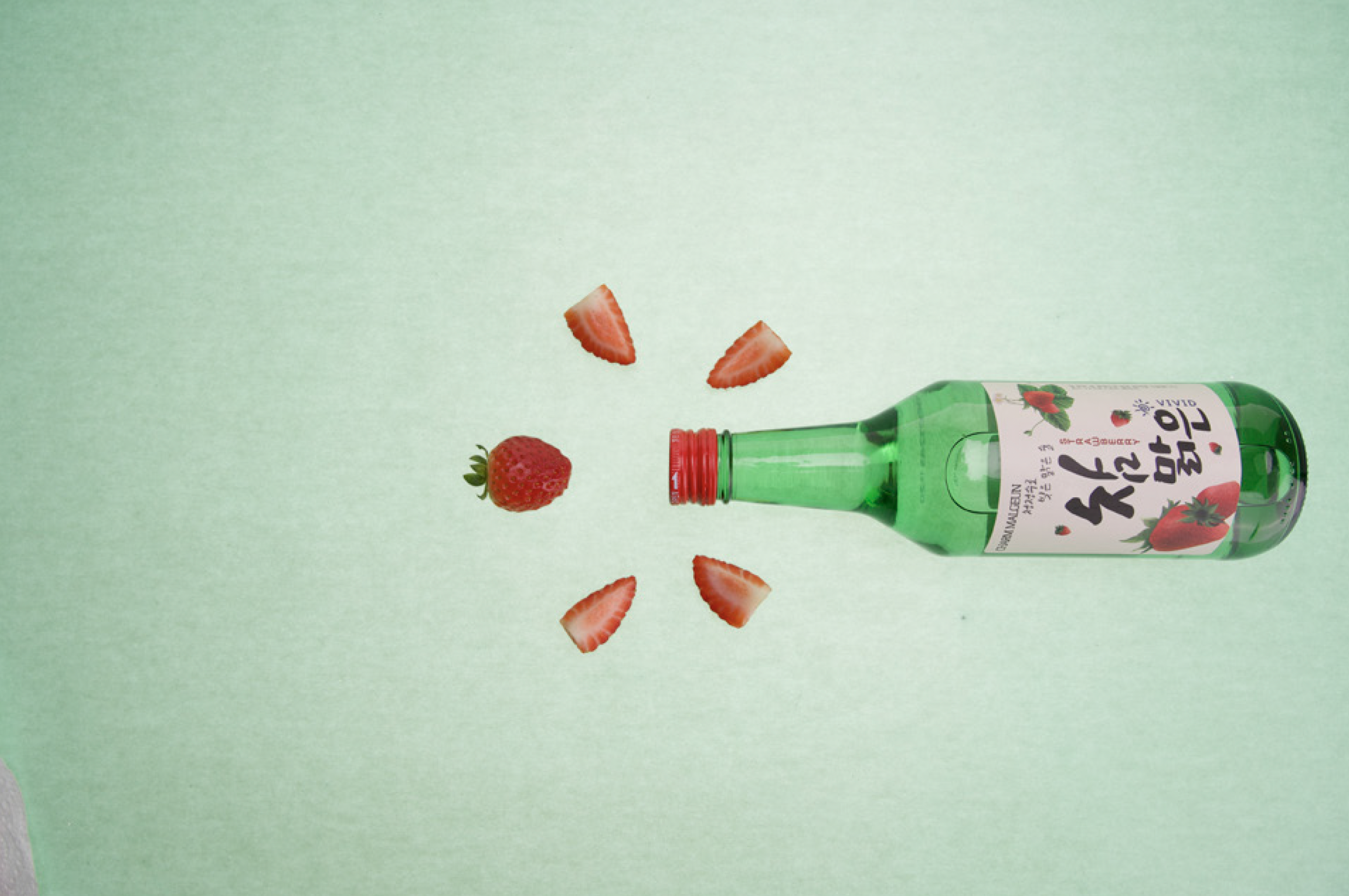
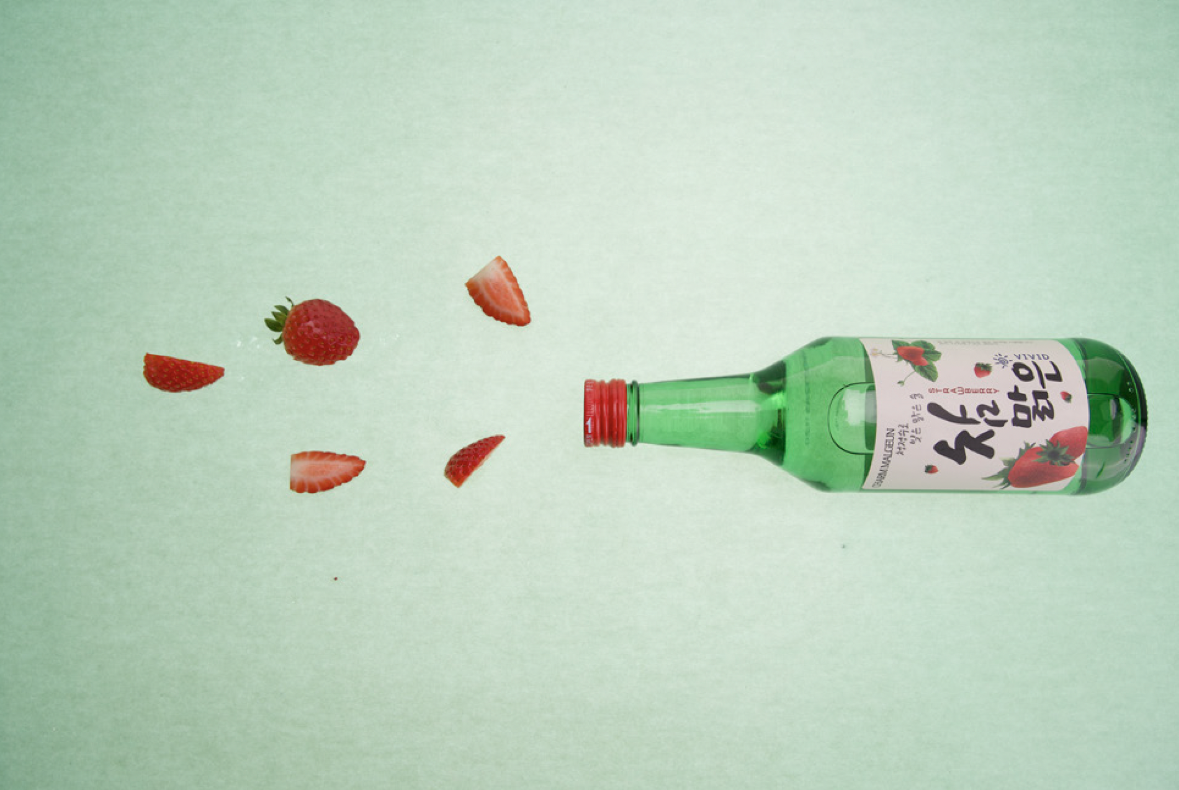
Experimentation
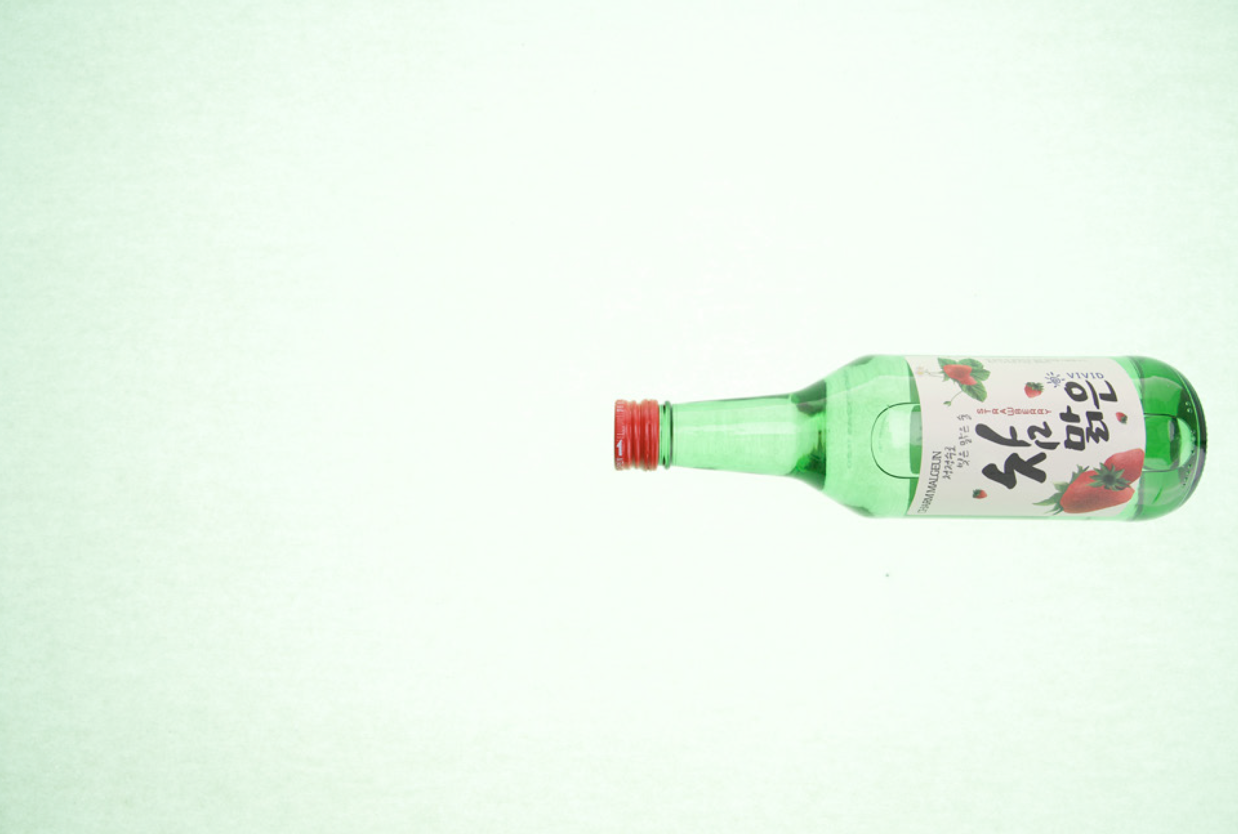
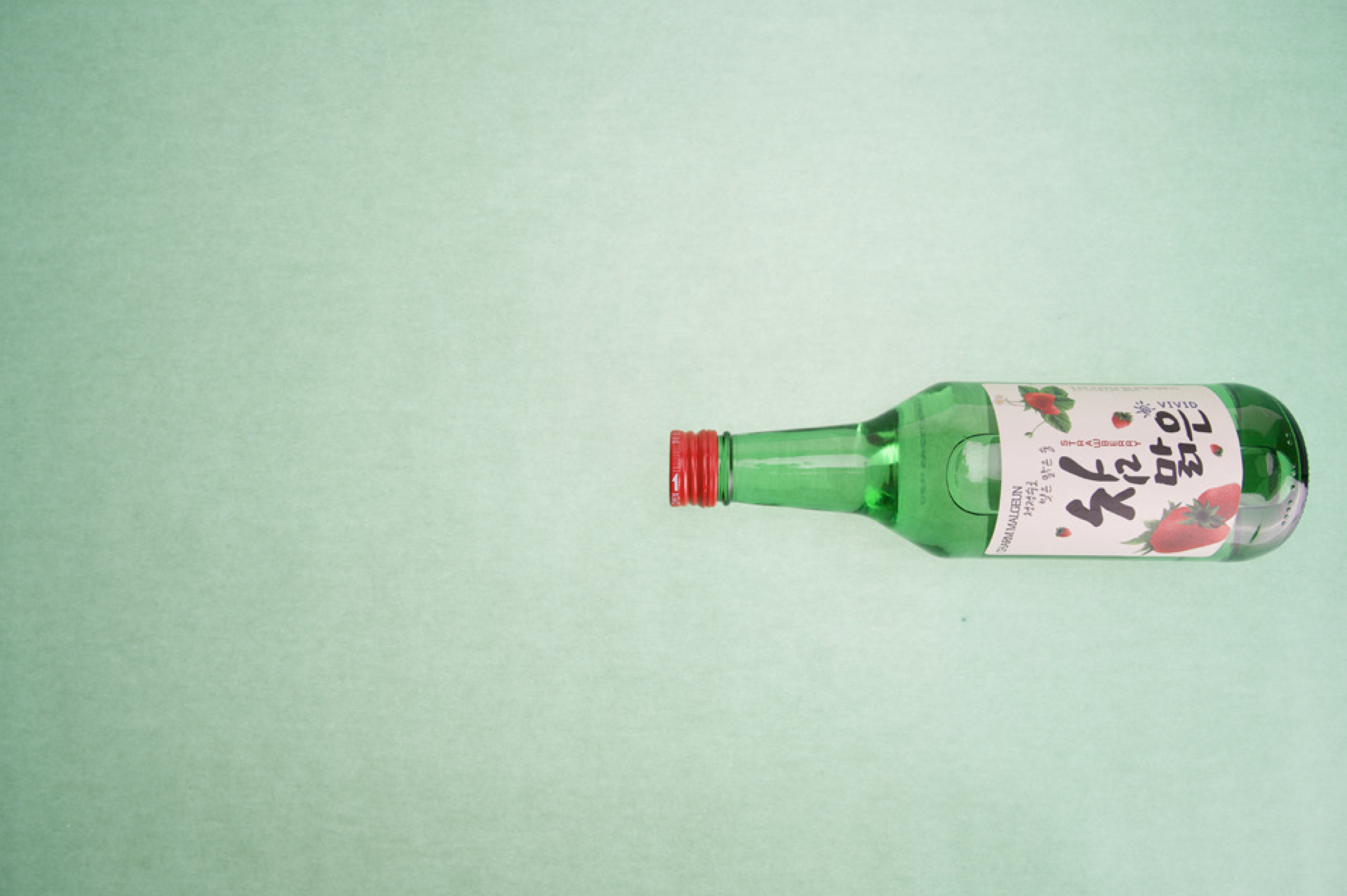
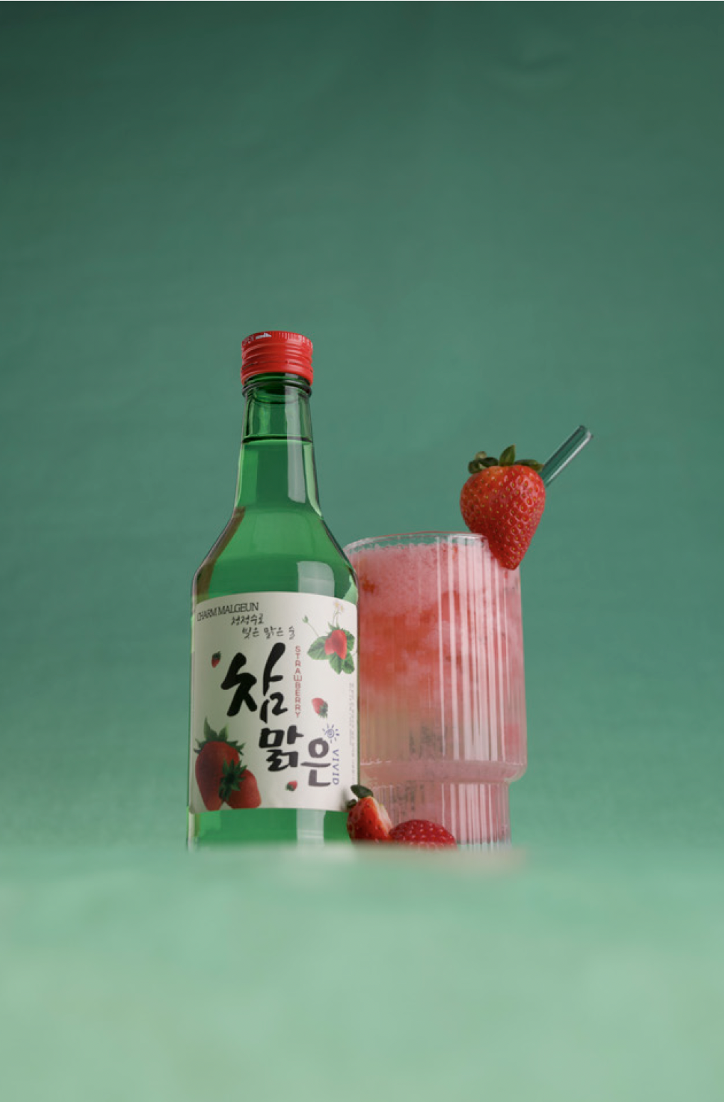
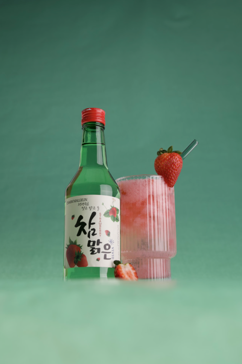
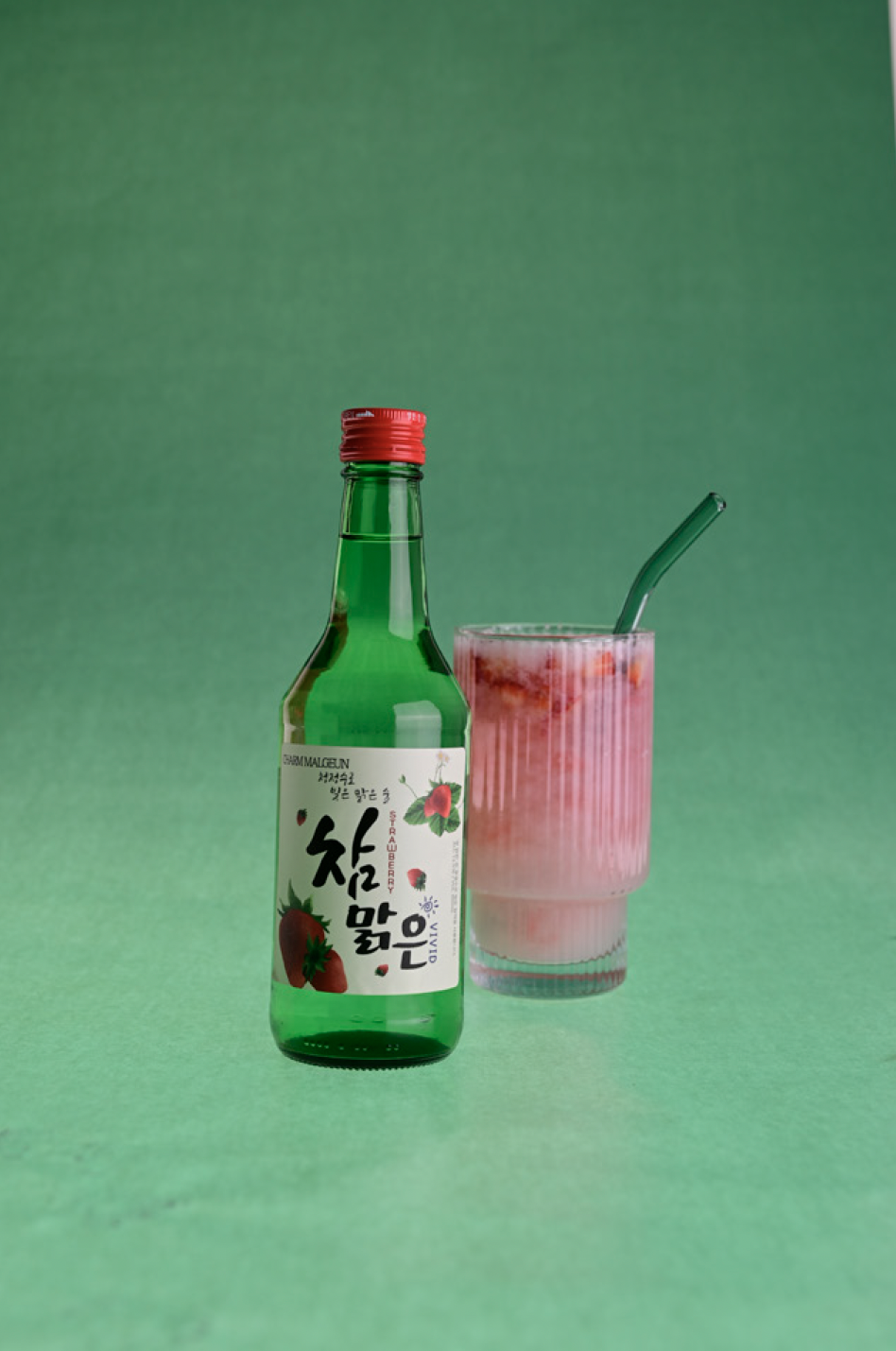
A variety of different angles of the soju bottle, as well as carefully arranged lighting on the strawberries and the cup, were thoughtfully experimented with to achieve the best possible composition. Different camera angles were carefully adjusted to lower positions in order to create natural blurs at the base of the bottle, effectively minimising any distractions in the background. Additionally, highlighters were strategically used to emphasise the matte texture of the bottle, enhancing its tactile quality. These combined techniques resulted in a visually appealing and polished final image that draws the viewer’s attention to the product’s key features.
Final Outcome

